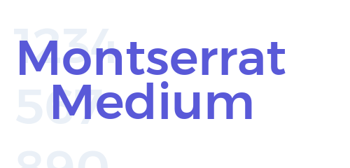
Download Montserrat Medium Font For Free
Argentine graphic designer Julieta Ulanovsky designed the Montserrat Medium Font and released it in 2011. Montserrat is a geometric sans-serif typeface. The general design is inspired by posters, signs, and painted windows from the early twentieth century, seen in the historic Montserrat neighborhood of Buenos Aires.
It has clean lines, open forms, and good legibility are Montserrat medium font in Outlook. Additionally, it also consists of a slightly condensed width, with a wide range of other weights, from thin to black. Montserrat medium is a versatile and stylish font that can be used for a variety of purposes. It is a good choice for designers who are looking for a font that is both modern and timeless.
Features of Montserrat Medium Font
Here are some features of Montserrat medium font:
Geometric Design
Montserrat medium is classified as a geometric font with straight lines and curves that are based on perfect circles and squares. This is what gives the font its modern and contemporary feel.
Open Forms
Apertures are the spaces inside the letters and Montserrat medium font has made good use of it with its open forms, which means the apertures are large. This makes the font easy to read, even in small sizes.
Condensed Width
The condensed width of the Montserrat medium font is very useful. Since the letters are narrower than they are tall, This makes the font ideal for use in smaller spaces, such as on websites and mobile devices.
High Legibility
Thanks to its open forms and condensed width. Montserrat medium is very readable regardless of the size of the text. This makes it a good choice for body text, as well as for headings and other display elements.
Versatility
Something common between the Montserrat family is their versatility. This makes the font Montserrat medium useful for several uses, from websites and digital media to branding and marketing materials to editorial design, signage, and posters.
In addition to these general features, the Montserrat medium also has some specific design details that make it unique. For example, the letter Q has a small tail, and the letter J has a distinctive crossbar at the top. These details add personality and character to the font.
Tips to Use Montserrat Medium Font
These are some tips for using Montserrat Medium Font:
Pair it with Other Fonts to Create Contrast
Pairing the Montserrat medium font with other fonts will give your project a unique and professional appearance. Montserrat Medium is a versatile font that can be paired with a variety of other fonts so you can use it to your benefit. For example, you could pair it with a serif font, such as Georgia, or with a script font, such as Pacifico, for a more playful look.
Use it for Headings and Subheadings, Body Text, and Branding Materials
The display look of Montserrat Medium makes it a perfect choice for headings, subheadings, and other elements because it is easy to read and conveys a sense of importance and also due to its condensed font size and modern look. You can use it to create a hierarchy of information on your page website or logo for brands.
Use it for Signage and Posters
The Montserrat Medium is a good choice for signage and posters because it is easy to read from a distance. You can use it to create messages that will capture people’s attention.
Use it Sparingly
Using fonts sparingly is important, especially for fonts like Montserrat Medium font. Due to the strong and bold letter of the font, it is best to use it sparingly. Overusing the font will make your text seem overwhelming.
Use it for the Right Purpose
Montserrat Medium is a good choice for a variety of purposes However, it is not made for all types of texts. For example, you would not want to use it for a wedding invitation or a children’s book.
Experiment with Different Sizes and Weights
Being versatile is one of the main features of Montserrat Medium font. It is available in a wide range of sizes and weights. You can experiment with different combinations to find the look that best suits your needs.
Use Kerning to Improve Legibility
Kerning is the process of adjusting the spacing between letters to improve readability and make it easy to read. Since Montserrat Medium font is a monospaced font, meaning that all of the letters have the same width. This can make the text look a bit choppy, especially in large sizes. You can use kerning to improve the legibility of your text by adjusting the spacing between certain letter
How To Download Montserrat Medium Font
You can download Montserrat Medium Font from our website for free. There are also good sources to download the Montserrat Medium font such as Google Fonts and Adobe Fonts. Once you have downloaded the Montserrat Medium font files, you can install them on your computer by following the instructions for your operating system. Make sure to download the font files from a reputable source to have a virus-free experience and download the font files in a format that is compatible with your software.
Conclusion
Montserrat Medium font is a geometric sans-serif typeface inspired by posters and window designs with a clean and modern appearance. The Montserrat medium font is versatile, modern, and highly legible so users can use the font for their individual needs while they can also make their projects stand out. Montserrat medium font can be put to use for several uses but it’s best to use more carefully and sparingly so you can use the font to your advantage. If you want to download Montserrat Medium Font, then you can get it from our website for free.
FAQs
What is Montserrat Medium?
Montserrat Medium is a geometric sans-serif typeface released in 2011, designed by Julieta UlanovskyThe basic design is inspired by posters, signs, and painted windows from the first half of the twentieth century, seen in the historic Montserrat neighborhood of Buenos Aires.
What are the features of Montserrat Medium?
Montserrat Medium font is known for its clean lines, open forms, and good legibility with a slightly condensed width, which makes it ideal for use in smaller spaces. The font is also available in a wide range of other weights.
What are some tips for using Montserrat Medium?
A few basic tips for using Montserrat Medium are pairing it with other fonts to create contrast, Using it for headings and subheadings, as well as using it for body text, branding, marketing materials, and signage and posters.
How can I download the Montserrat Medium font?
There are several ways to download the Montserrat Medium font but the best options are, from Google Fonts and Adobe Fonts website.
What is the difference between Montserrat Medium and Montserrat Regular?
Montserrat Medium has a slightly thicker stroke weight than Montserrat Regular. This makes it more visible and easier to read when compared. Montserrat Medium is more of a headline and display font than the rest of its family.
What are some other fonts that are similar to Montserrat Medium?
The fonts similar to Montserrat medium font include Lato, Open Sans Roboto, Source Sans Pro, and Helvetica.


